*Aabent Sind
Åbent Sind is a group supported by SIND- Landsforeningen for psykisk sundhed that connects young people with social difficulties. Their goal is to build a community with young-to-young relationships.

Åbent Sind is a group supported by SIND- Landsforeningen for psykisk sundhed that connects young people with social difficulties. Their goal is to build a community with young-to-young relationships.
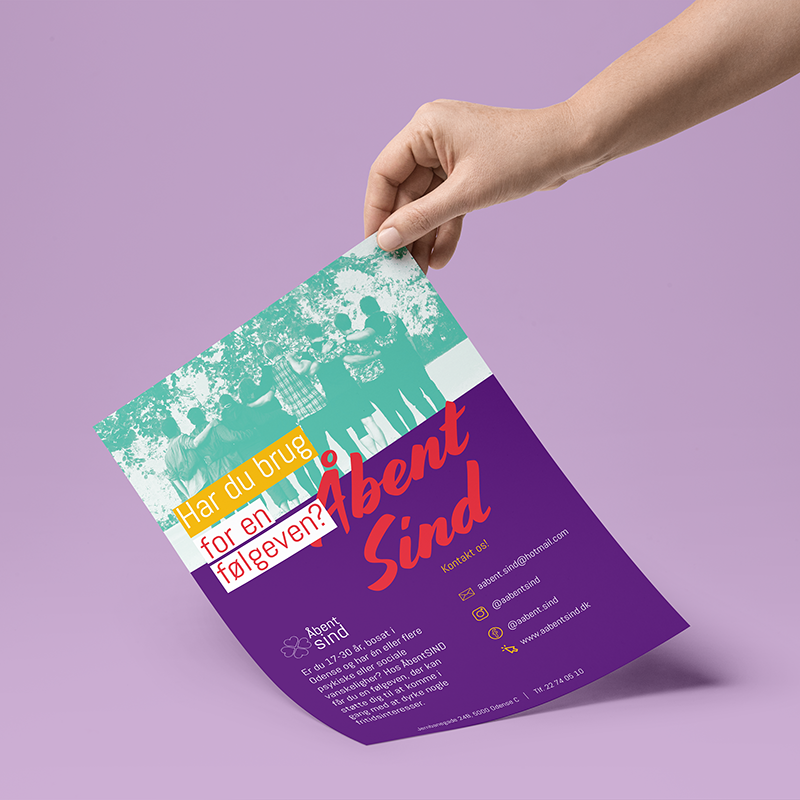
They needed to create awareness about the project through social media, flyers, and banners. Their challenge was to develop marketing materials that could stand out and reach their public. That's why we decided to focus on a new branding and visual identity for Åbent Sind.
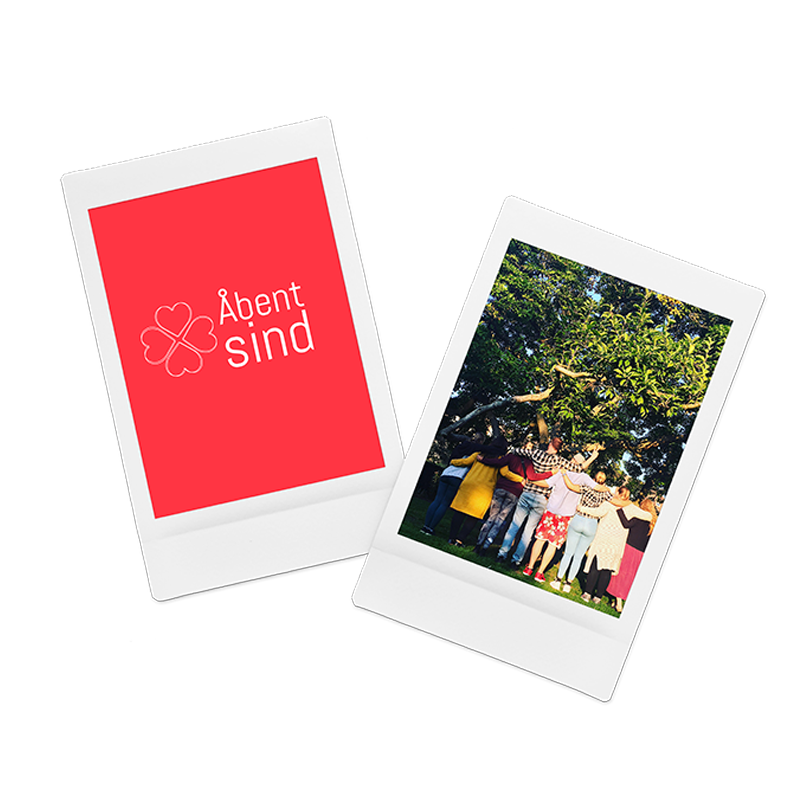
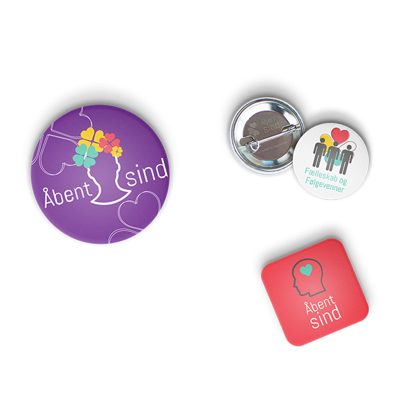
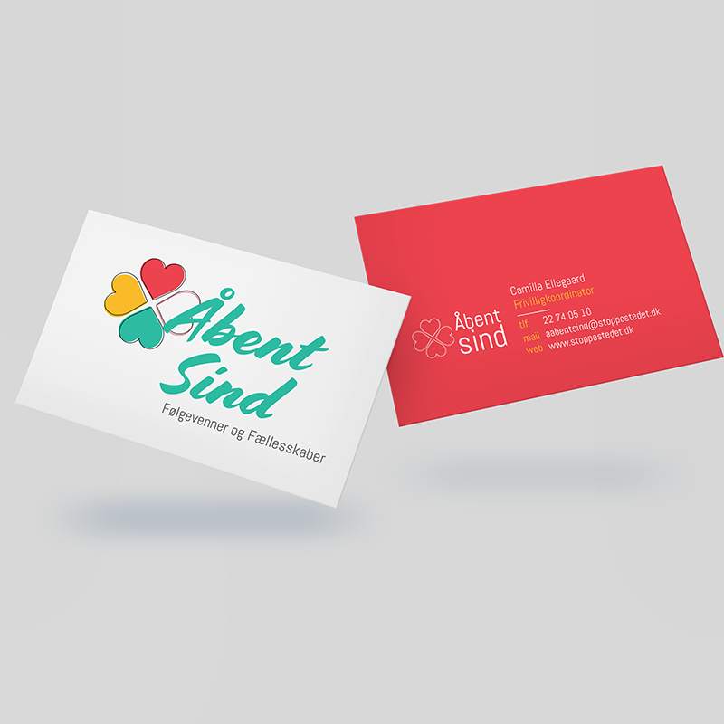
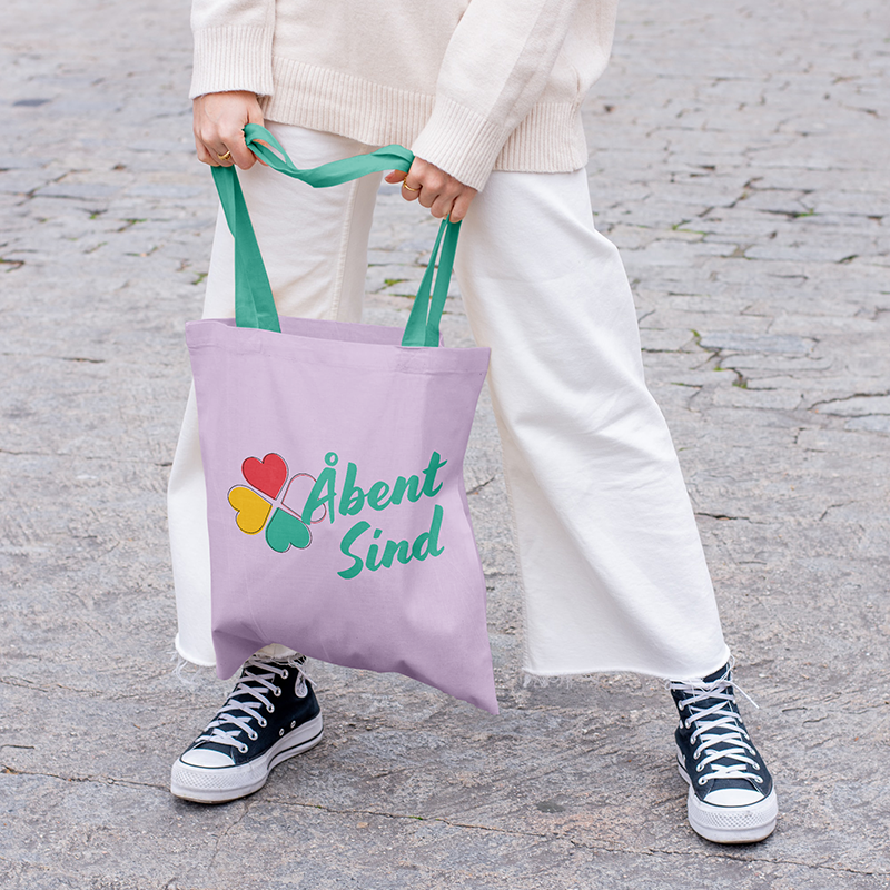
Since the heart is an outstanding graphic element for SIND, we've used it as an inspiration. You can see it in the new logo, associated with a four-leaf clover image (now with the hearts). The idea is to combine the four-leaf clover symbolic meaning (luck) with the group's fellowship.
The hearts also appear as a supportive element on the flyer and business card. The main difference is the new color palette and details used in the visual compositions. We've combined warm and bright colors with hand lettering, collages, and colorful photos. As a result, we have a youthful, carefree, and modern brand.
Learn more about the project here.